Data proves to be useful only when you can understand it. However, to understand it, you must be able to present information clearly and comprehensibly. Using spreadsheets to track and analyze data is becoming history. Today, decision makers want to see interactive dashboards to view data that tells them the right story!
But how do you journey from a chaotic spreadsheet to an informative dashboard? It is through data visualization and the tools that help you do it. You can leverage numerous tools to visualize data engagingly and help the user derive value from it.
Nevertheless, if you are new to the world of data visualization, here’s a guide that overviews some of the most preferred tools that offer data visualization services.
Data as plain numbers can be a messy scene. Difficult to understand and hard to interpret. But a data visualization tool presents and illustrates data through graphs and charts. These forms of data representation make understanding the data easier for the user.
Data visualization tools help managers, analysts, and executives comprehend the latest trends within various departments. They also enable decision makers to allocate resources, plan strategies, track sales, profits, and individual performance. Data presented in a straightforward yet effective manner can drive informed decisions.
Some common forms of visualization that the tools offer include:
Some more specific forms include bullet graphs, bar charts, area map, Gantt chart, heat maps, histograms, and highlight tables.
Still stuck in spreadsheets? Let Diacto transform your data into interactive dashboards that drive smarter decisions.
Google Sheets and Excel surely deserve applause. They’ve been in use for generations, helping users organize and perform basic analysis.
But when you deal with a larger dataset or want to communicate insights to others, you need tools that help you go beyond the basics.
This is where interactive dashboards step in! They enable you to show key metrics and data points in a visually appealing manner. Besides, users can easily digest information presented in this form. They can interact with the data, magnify specific details, filter through categories, etc., in real time. Some differences between the two include;
| Aspect | Spreadsheet | Interactive Dashboards |
| Presentation | Raw and unformatted data arranged in rows and columns | Visual representations through graphs, maps and charts. |
| Interactivity | Static | Filtering, drilling down and exploring is possible |
| User Experience | Can be overwhelming | User friendly and intuitive |
| Customization | Custom formulas but restricted to data cells and formatting | Customizable layouts, visuals and interactive per user requirements |
| Data Analysis | Basic analysis with functions and formulas | Advanced analysis and real time data exploration |
Let’s now review some of the most popular tools that offer data visualization services.
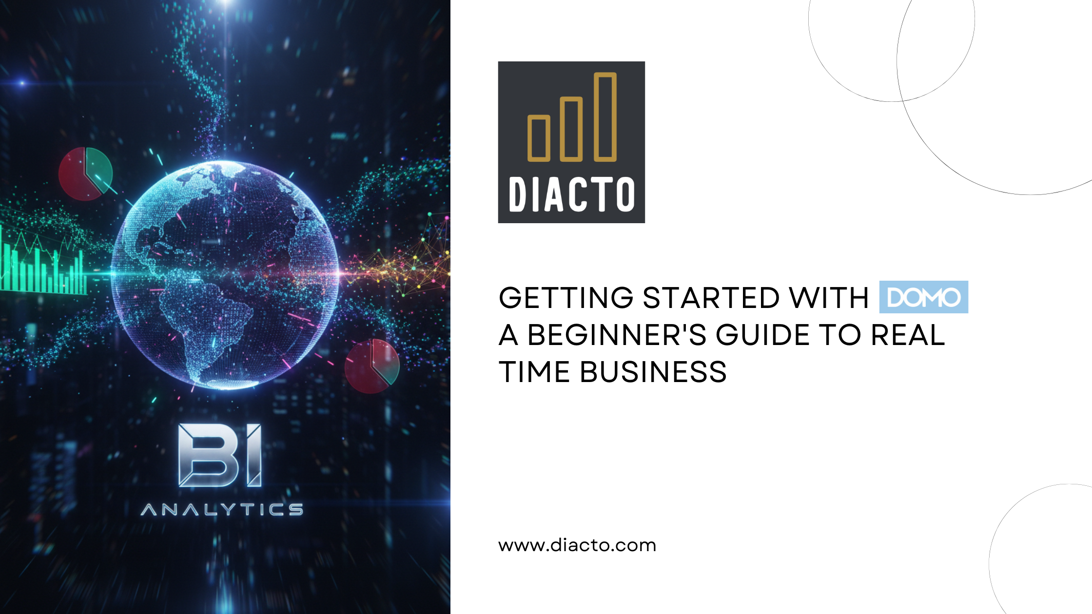
DOMO is a BI and data visualization platform that helps businesses integrate, analyze, and visualize data in real time. It enables users to create interactive dashboards, visualizations and reports through multiple data sources.
The platform offers features, including data integration, customization dashboards, advanced analytics, collaboration, scalability and data security.
Tableau is among the most preferred tools. It enables you to connect multiple data sources and offers a drag and drop interface that helps create wonderful and interactive dashboards. You can also seek help from the extensive documentation and innumerable tutorials while using Tableau.
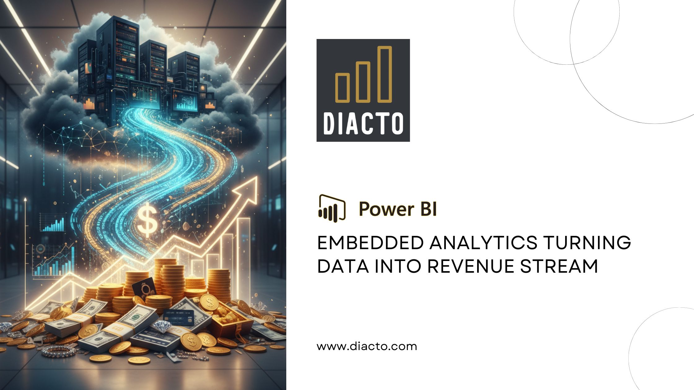
Power BI is a Microsoft product, available for on-premise installation and cloud deployment. It has numerous backend databases, including Salesforce, GitHub, Oracle, PostgreSQL, Teradata, Azure, Adobe Analytics, Excel, and SQL Server. Power BI doesn’t require any specialized technical support. Besides, it offers high level security, integrates easily with existing applications, and doesn’t have any speed or memory constraints.
Visual.ly is famous for its extensive distribution network that showcases project outcomes. The tool has a dedicated creative team for data visualization services. It also streamlines data importing and outsourcing. Some advantages of Visual.ly include premium output quality, multiple linking opportunities, and easily producible graphics.
Sisense is an agile data visualization tool that offers users instant data analytics on the go. It identifies key data patterns and summarizes statistics to help decision makers make informed, data based decisions. Sisense is an apt tool for mission critical projects that involve massive datasets, quick upgrades, a reliable interface, and seamless customization.
High charts is an apt visualization tool, particularly if you want to stream big data analytics. It runs on the JavaScript API and offers integration with jQuery. The tool provides cross browser functionality support, facilitating easy access to interactive visualizations. High charts is a great choice for customizations, numerous chart layouts, visually attractive graphics, and its simplicity and flexibility.
Choose Diacto! We are data specialists with a comprehensive range of data services, including visualization. Our experts specialize in multiple tools, simplifying data comprehension and interpretation. Thus, you can rely upon it when it comes to leveraging data, making informed decisions, and deriving optimal value from it. Want to know more? Connect with us at info@diacto.com.